Numinar
Redesigning a campaign platform to be clearer and easier to use.
April 21, 2025 ⋅ 5 minutes read

- Type
- Webapp, Product
- My Role
- Product Designer
- Year
- 2025
- Duration
- 1 month
Overview
Numinar is a political technology company leveraging AI and software to help political candidates run data-driven campaigns, I worked as the product designer on a one-month engagement, alongside a product manager. The client name is cleared for public use.
Problem
The client’s brief:
The design lacked visual quality, and as a result users were dropping off — they didn’t know what to do, and couldn’t find what they were looking for.
The diagnosis was aesthetic. What it pointed at was structural: metrics at identical weight with none primary, tables built from record metadata with no status or outcome in them, empty states written as bare text.
Four of the main sections each carried a permanent explainer.
Messages
“What are messages?”
Data
“What are tags?”
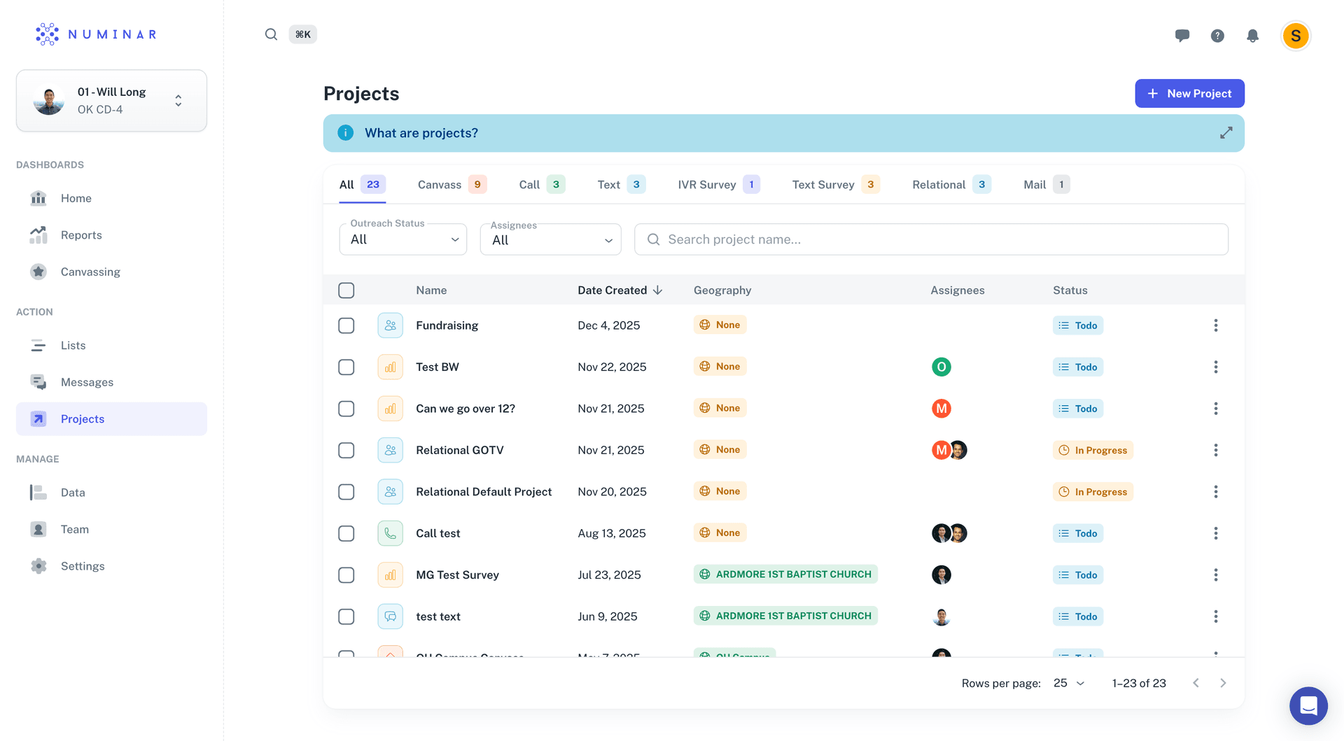
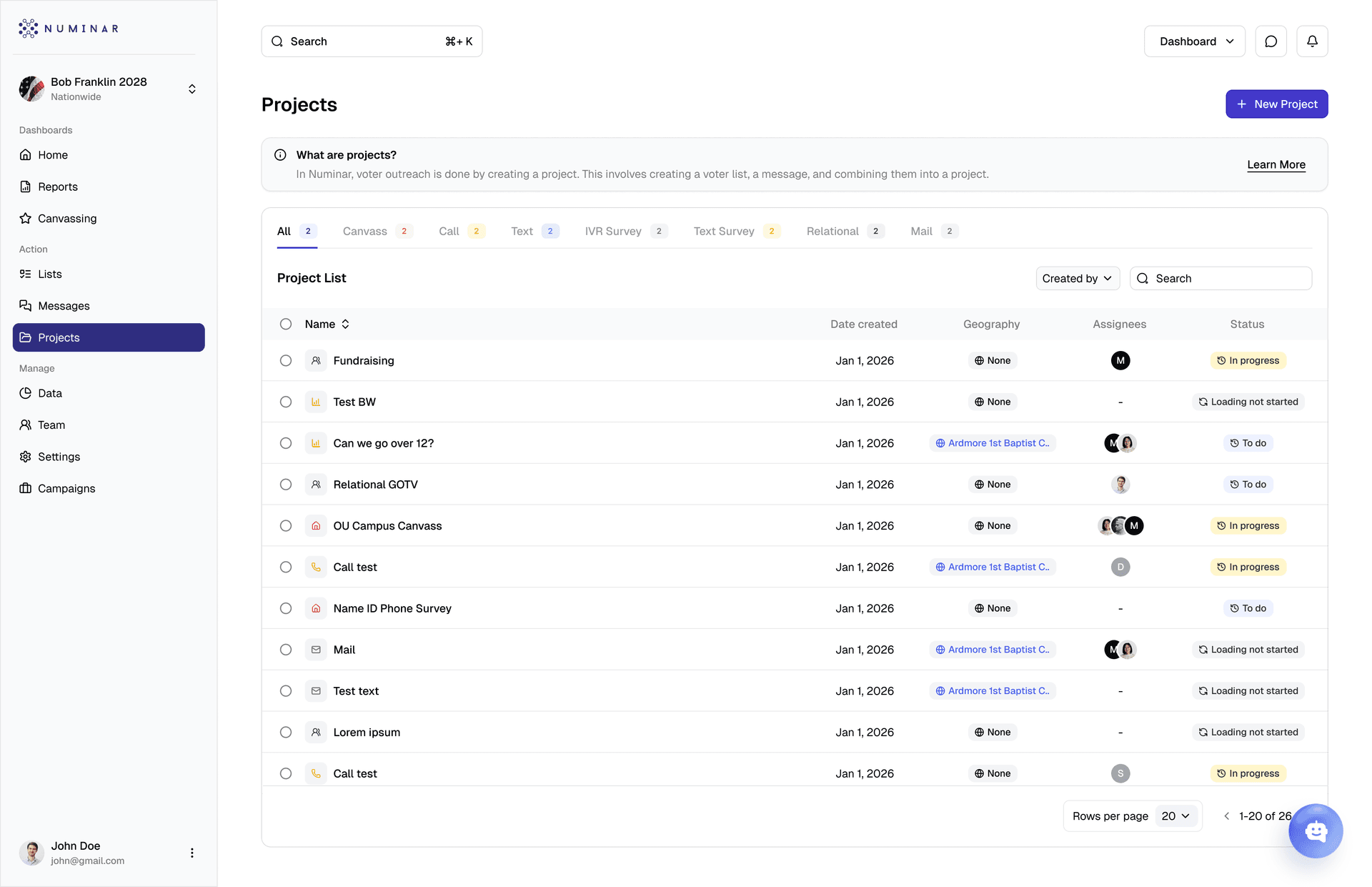
Projects
“What are projects?”
Lists
“What are voter lists?”
A product that needs a standing explanation on most of its main pages is describing in text what its structure fails to convey.
The stakes were not cosmetic. Capability that users can’t find or act on doesn’t just fail to earn back its build cost — “not discovered” reads as “not wanted”, and the roadmap gets pointed at the wrong thing.
Approach
The client owned the product decisions. what to build, which capabilities to add, which explanatory patterns to keep. The design work was to decide what form those decisions took in the interface.
Two tracks ran in parallel. The consistency track was the larger volume of work; the capability track carried the harder decisions, because there was nothing to compare against and no established convention inside the product to defer to.
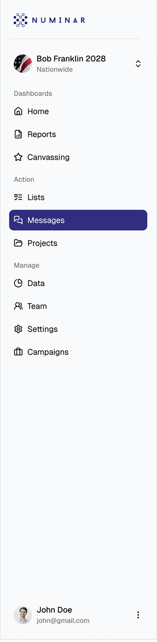
 ReportsSettingsCanvassingTeamListsDataMessagesProjects
Eight areas, one system to keep consistent, most followed existing patterns, while three needed new ones from scratch.
Solution
- System-wide consistency
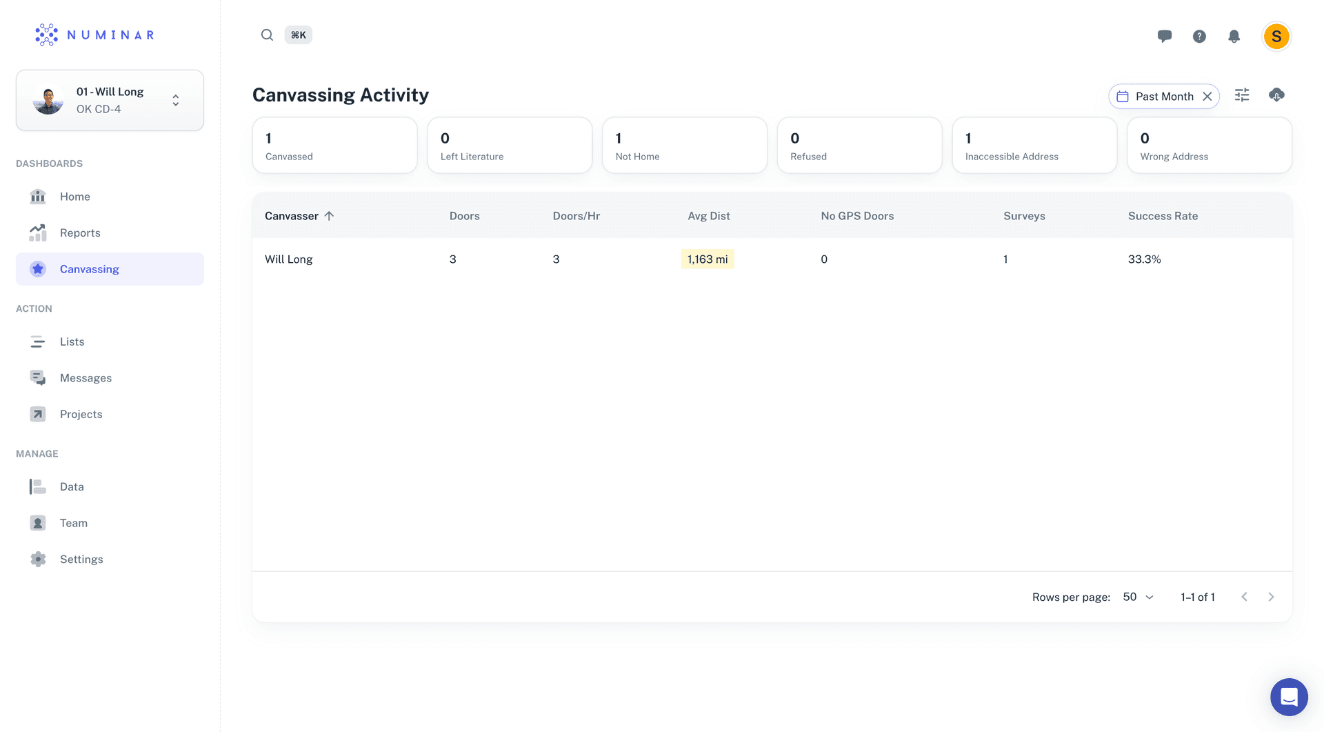
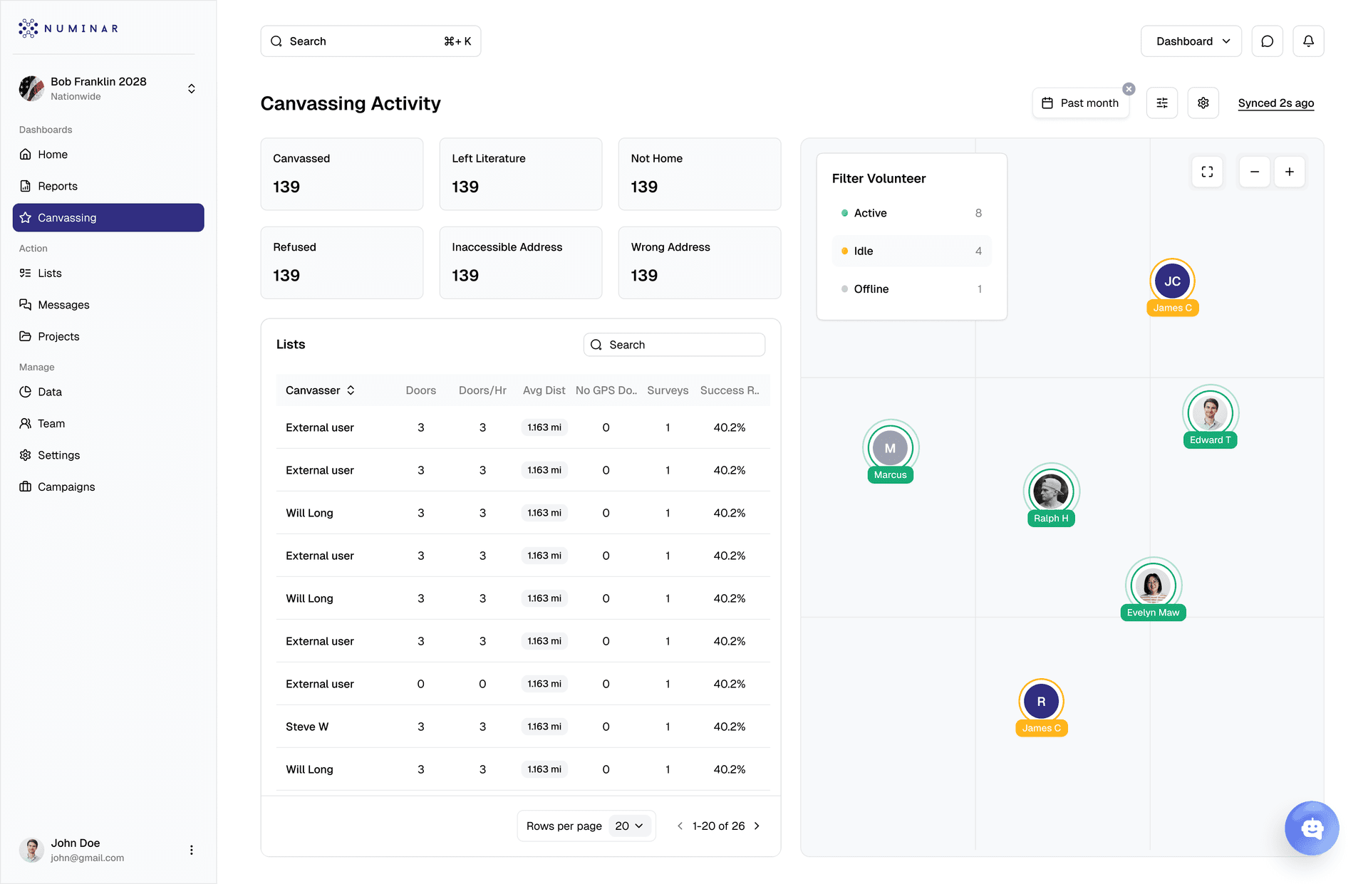
One component system across all eight surfaces. here’s a few of them:
- Survey form builder
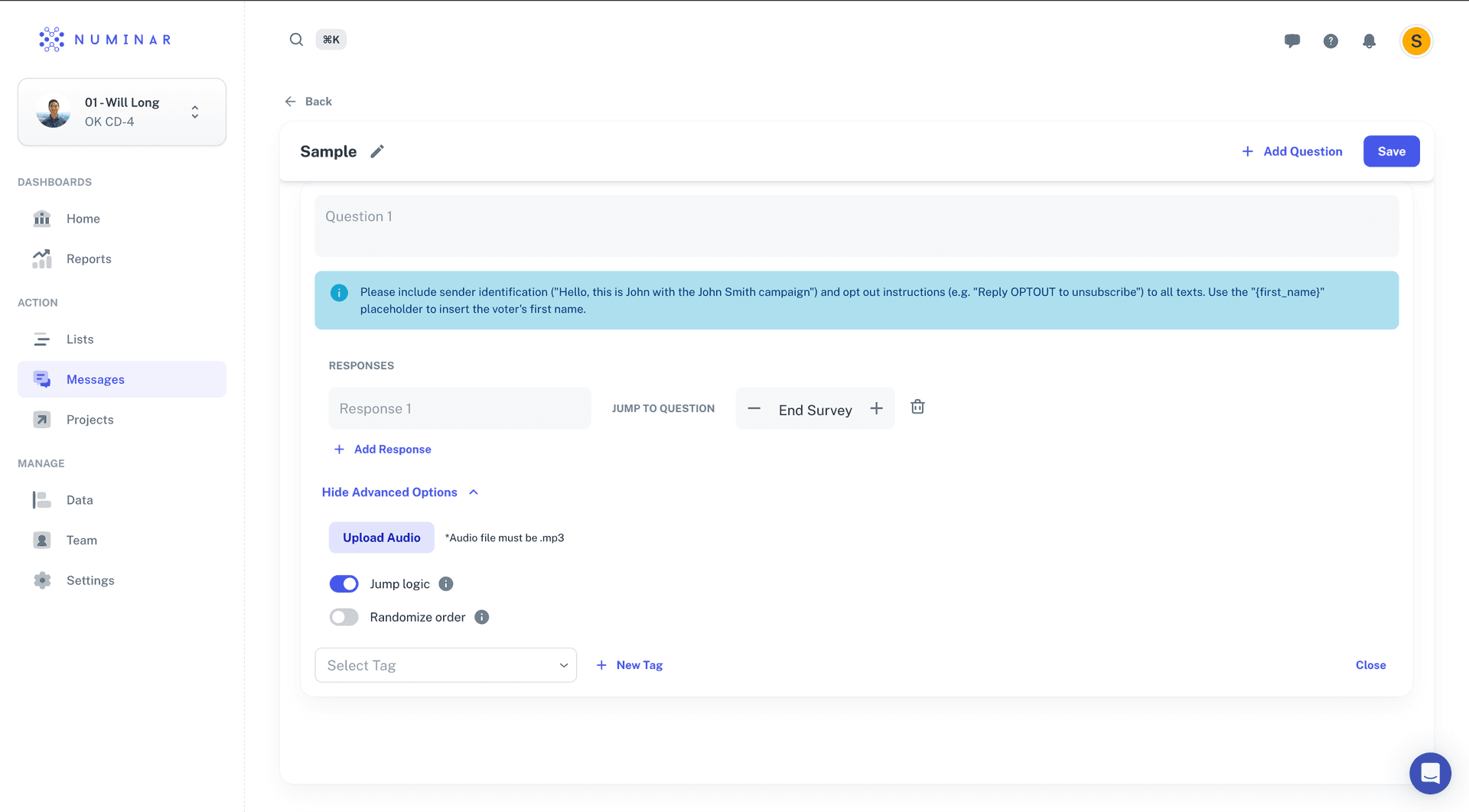
In the old builder, question type was not an explicit choice. Branching sat behind a “Hide Advanced Options” toggle, expressed as an on/off switch, with audio in the same panel. The question list was a flat “Responses” structure.
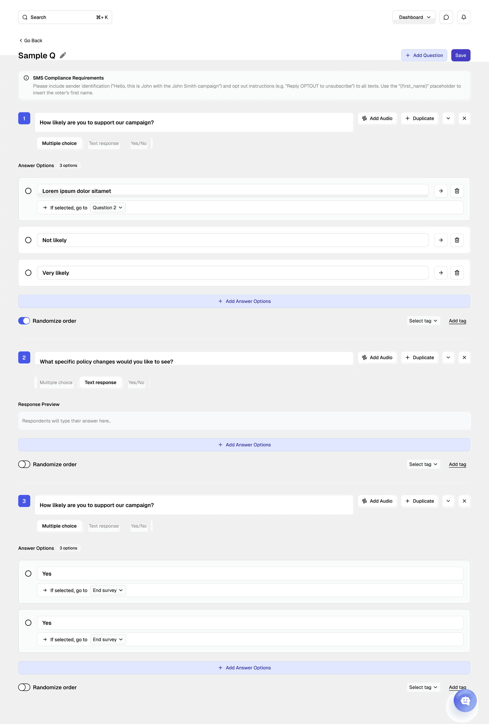
Now question type is an inline toggle on each question. multiple choice, text response, yes/no. Branching is a property of every answer (“If selected, go to Question 2”, “End survey”), on screen without opening anything. Audio is a per-question button; answer options are numbered.
Nobody has to discover that branching exists before they can use it.
- Canvassing dashboard
“We just added a new page for a dedicated canvassing dashboard but would also like to add a map that includes the live geolocations of volunteers using the app. Could you create a design for that too?”
Canvassing kept a split layout instead of the standard table page.
Every other record-browsing surface uses the same full-width table shell. Canvassing is for watching a shift in progress. The table pattern would have cost the only view that answers who is where, right now.
- Segment builder
A new capability, with no equivalent in the old product. The old create-project modal contained five fields and nothing else: Project Name, Outreach Type, Voter List, Assignee, Status.
- Empty state first. The card starts clean, with a single high-visibility action “Add Segment to Balance”
- Natural builder. That opens a multi-select where the user defines the specific intersection they care about e.g female, age 18–34.
- Dynamic generation. Once confirmed, the UI generates a single dedicated row for that cross-section.
Outcome
Handoff CompleteThe stated goal was to stop the drop-off caused by unclear navigation and unexplained capability. Eight disconnected surfaces were replaced with one consistent system; four permanent "what is this" explainers came out because the capabilities they explained no longer needed explaining.
The client's team confirmed the outcome matched what the reasoning walkthroughs had set up and expect to carry the same system into how they build internally going forward.
Credits
- Client
- Numinar
- Agency
- JetDesigns
- Designer
- Seiya Sekha
- PM
- Karisa Saraswati