Tirra
A self-custody crypto wallet site and app, answering five key questions.
December 4, 2025 ⋅ 2 minutes read
.png&w=3840&q=75)
- Type
- Landing page, App
- My Role
- UI/UX Designer
- Year
- 2025
- Duration
- 2 weeks
Overview
Tirra is a crypto wallet aimed at people who don’t own crypto yet. the ones put off by seed phrases, gas fees and not knowing what a trade will actually cost them. Its promise is the last of those: every fee is visible before you commit.
Sole designer, self-initiated, under two weeks: product, interface and the site.
Problem
The FAQ names who the page is up against: someone who has never owned crypto and isn’t sure they can.
- Effort
- “How Long Does It Take To Get Started?”
- Trust
- “Is Tirra Safe To Use?”
- Trust
- “Why Should I Trust Tirra?”
- Effort
- “Do I Need Financial Knowledge To Use Tirra?”
- Reach
- “Is Tirra Available On Mobile Or Web?”
The genre answers that with borrowed credibility: logo walls, audit badges, TVL tickers. Tirra’s strip is placeholder, so the page has to answer structurally instead.
Approach
Each decision answers one of those questions, where it comes up.
Safety is answered three times: in the nav, the swap review, and Built for confidence.
Solution
Five sections down the page, then the app they point at.
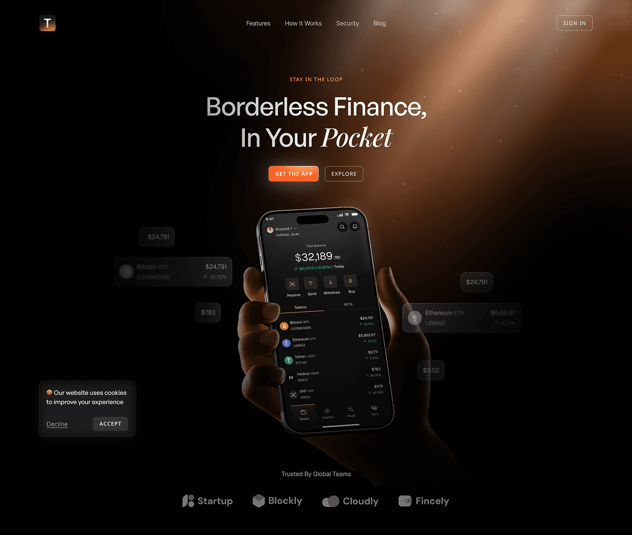
1. Hero
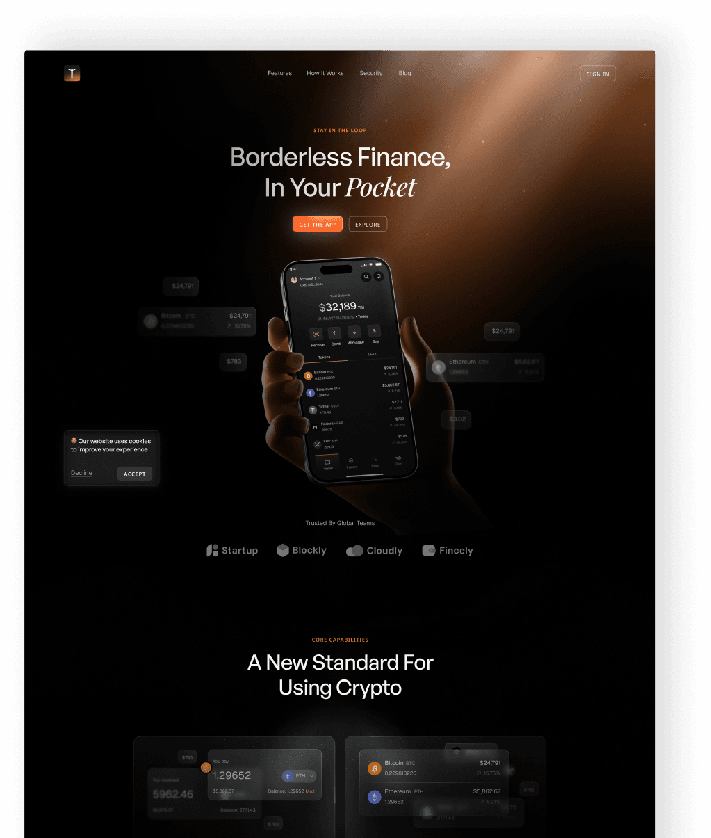
One headline, one filled button, one outlined. A beginner who isn’t ready to commit gets somewhere to go that isn’t the app store.
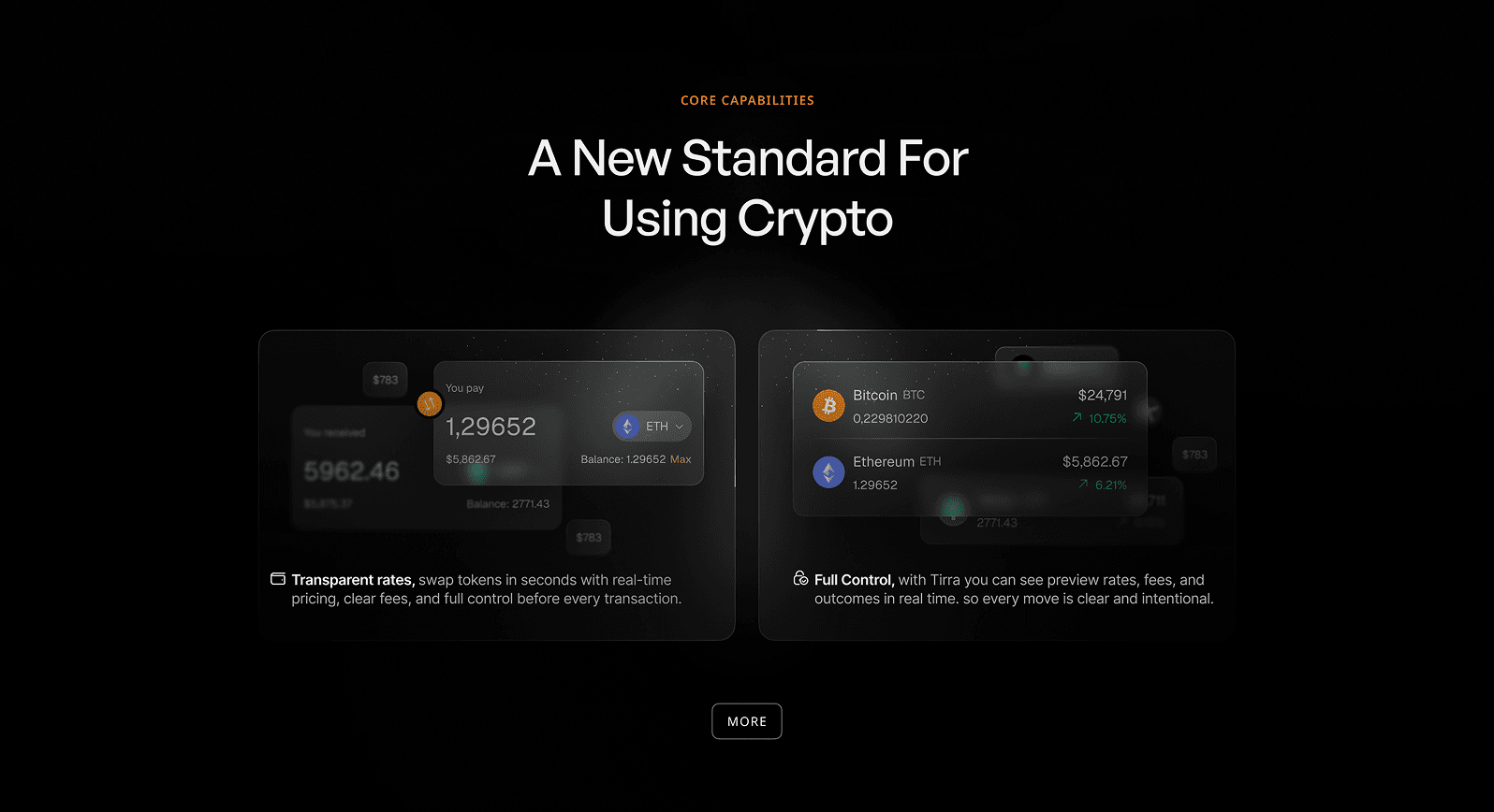
2. Core capabilities
Two cards, then MORE. Both lead on cost rather than capability — for someone deciding whether to start, what it charges matters more than what it can do.
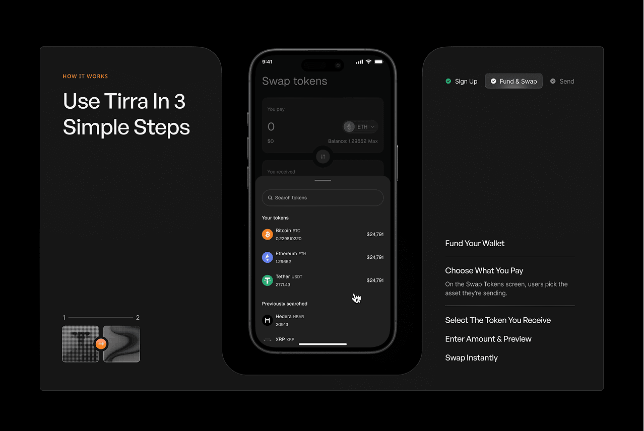
3. How it works
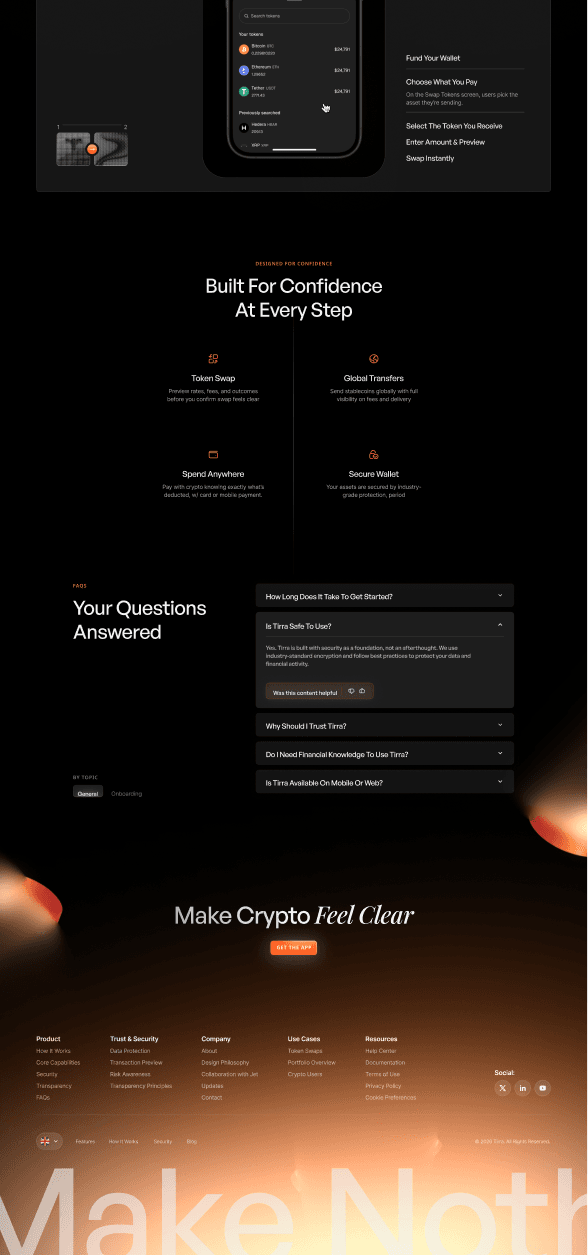
Three tabs, with Sign Up already ticked. Only the open step expands, so the whole process never looks longer than the part you’re on.
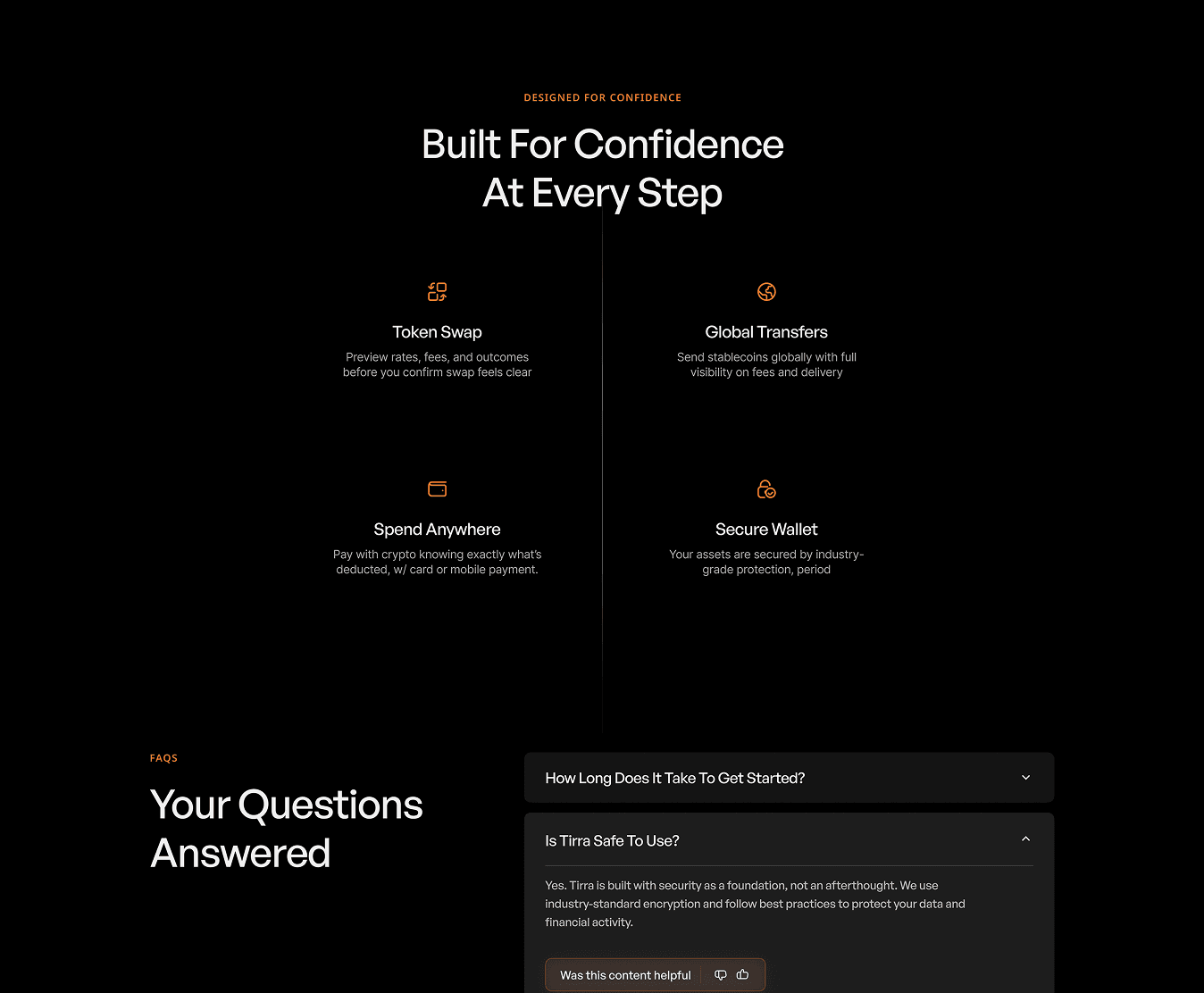
4. Built for confidence
Token Swap, Global Transfers, Spend Anywhere, Secure Wallet. The set covers what you can do and what keeps it safe, in that order.
5. CTA and Footer
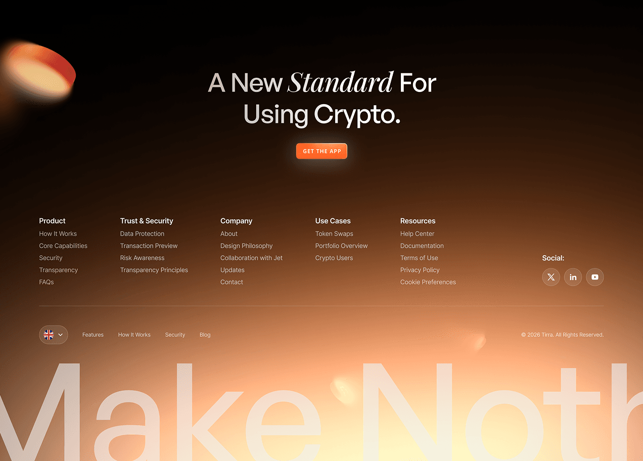
One headline, one button, nothing else. Anyone still reading has their answers, so the page stops selling.
6. App experience
Wallet, Explore, Swap and Earn in one tab bar. The wallet opens on the balance and four actions. what you have, before what you could do
Outcome
The goal was mine to set: show that a wallet aimed at beginners can earn trust by what it discloses, not by whose logo it borrows. What came out is a site and a four-area app built on one promise.
Nothing has followed. No user has opened it and no number sits behind it. The argument is complete and untested.
Credits
- Product
- Tirra
- Agency
- JetDesigns